Analyzing inactive and purged voters in the Georgia Voter File with R
Bradley WyrosdickBlockedUnblockFollowFollowingDec 2
Introduction
The most recent midterm election prompted discussions and debates about how, when, and why voters should be purged from voter registration files. To be purged means that a voter has been removed from a state’s voter registration. Georgia Governor-elect and former Georgia Secretary of State Brian Kemp, who was under close watch this midterm season, was accused of allegedly removing hundreds of thousands of voters over the years who tended to be people of color. Not only did analysts find a disproportion in who was removed from the voter files, but many of these voters were totally eligible and not aware that they were removed. To try and better understand the process of removing voters, I looked at Georgia voter registration files from September and November of 2017 to see who is being removed, why they are being removed, when they are being removed, and who these voters are by race. I’m interested in race because it is often the focus of debates about voting rights and voter suppression in Georgia and throughout the country.
Tools and Data
For this project, the I am using the September and November 2017 Georgia Voter Files. To analyze the data, I am using R with R Studio and a few helpful libraries.
library(tidyverse)
library(RColorBrewer)
library(lubridate)
library(ggpubr)
library(scales)
The Tidyverse is the most helpful library for tidy(ing) the data. It allows me to sort my data easily. For example, it gives the ability to easily filter by attributes of certain values or group by certain columns. This is very useful when I’m creating subsets of my data. Most of the other libraries are just for aesthetic purposes for the graphs.
To tidy my data, I created two functions for converting variable types — changing character types to dates or numeric types — and a vector to help eliminate unwanted and not useful columns in my data.
# We need to change our dates to Date types
setAs("character","myDate", function(from) ymd(from))
# We are only given birth year, so we need to convert that to their # age
setAs("character", "age", function(from) as.integer(2017 – as.numeric(from)))
# We need to skip some columns that are not useful to us
# as well as read in the correct type for the column
readcolumns <- c(rep("character", 3), rep("NULL", 9), rep("character", 2), "age", "myDate", rep("character", 2), rep("NULL",2), rep("character", 2), rep("NULL",25), rep("myDate", 4), "NULL", "character", "myDate", rep("NULL", 9))
# Sept 2017 GA Voter File
working.dir <- "C:/Users/Bradley/Desktop/Election Research/Georgia_Daily_VoterBase/"
ga_voter.file <- paste(working.dir, "Georgia_Daily_VoterBase.txt", sep="")
ga_voter.sept17 <- as.tibble(read.csv(ga_voter.file, header = TRUE, sep = "|", quote = "", dec = ".", colClasses = readcolumns, fill = TRUE, stringsAsFactors = FALSE))
colnames(ga_voter.sept17)[6] <- "AGE"
To make dates easier to work with, I created a wrapper function that uses the ymd() function (year, month day) from the lubridate library. This function converts date columns to a date type.
The Georgia voter file does not include age, but birth year instead. I created a function to convert birth year to age in years. I also changed the column name to “AGE”. I did not end up using this attribute for this project, but it may be useful in future analyses.
I used all the same functions and the “readcolumns” vector on the November 2017 Georgia voter file as well.
You can find all the code for this project on my github.
Analysis
To begin my analysis, I looked at inactive voters and their “date changed” status in the September 2017 Georgia Voter Files. In the Georgia Voter file, the date changed category is the date the registration was last updated by an election official. I decided to look at the frequency of dates changed among inactive voters to because if a massive voter purge were to begin it’s process, I would expect to see a large amount of voters statuses being changed to inactive in large groups. In doing so, I found three major “spikes”: August 8th, 2015, October 5th, 2015, and August 9th, 2017.
# All Inactive voters from the Sept 2017 voter file
inactive.sept17 <- ga_voter.sept17 %>% filter(VOTER_STATUS == "I")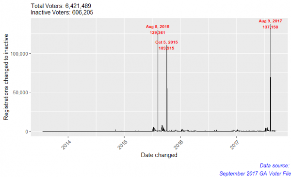
Why are so many registrations changed on these dates?
These spikes give insight into the Georgia voter purging process. The large spikes of registrations changed to inactive is because Georgia cleans their voter files on off years from major elections (Midterms and Presidential), which is why the dates are a year apart, but at the same time of year. I found the spikes interesting none-the-less. Out of the three major spikes, I decided to look at the August 9th, 2017 for two main reasons:
- I have other voter files from 2017, so I have more data to work with for that year.
- On August 8th, 2017, the Justice Department decided Ohio’s method of massive purges of voters was acceptable. Georgia uses a similar method to purge voters as Ohio.
Throughout the analysis, I will refer to August 9th, 2017 as “the spike”.
Who is in the spike?
First, I wanted to see what percentage of voters in the September 2017 voter file were in the spike. Next, I wanted to see, of all the inactive voters in the September 2017 dataset, how many were in the spike.
# Inactive voters in the spike
inactive.spike <- inactive.sept17 %>%
filter(DATE_CHANGED == “2017–08–09”)
# voters in spike / all inactive voters
spike_by_inactive <- nrow(inactive.spike) / nrow(inactive.sept17) * 100
# voters in spike / all voters
spike_by_total <- nrow(inactive.spike) / nrow(ga_voter.sept17) * 100
spike <- tibble(Voters = c('Of Total', 'Of Inactive'),
Percent = c(spike_by_total, spike_by_inactive))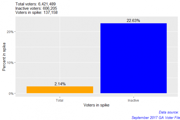
The spike contains 2.1% of all voters and 22.6% of all inactive voters in the September 2017 Georgia voter file. So, the spike contains a large proportion of the inactive voters in the dataset.
Next, I looked at the racial breakdowns of all voters, inactive voters, and voters within the spike. To examine any potential disproportion of membership in the spike, I created and visualized three subsets of populations within the dataset:
- Voters in the spike
- Voters who are inactive
- Total voters in the entire September 2017 voter file
Using these subsets, I grouped them by race. By comparing percentages in the spike and in total inactive voters to percentages of voters, I can examine whether the presence of one group in the spike or in inactive is disproportionate to their overall representation in the dataset. For example, if one group represents a larger proportion in the spike than in total, it is disproportionate.
# Total percent by race
total.race <- ga_voter.sept17 %>%
group_by(RACE) %>%
summarise(Total = n()/nrow(ga_voter.sept17) * 100) %>%
arrange(desc(Total))
total.race
# Spike percent by race
spike.race <- inactive.spike %>%
group_by(RACE) %>%
summarise(Spike = n()/nrow(inactive.spike) * 100) %>%
arrange(desc(Spike))
spike.race
# Inactive percent by race
inactive.race <- inactive.sept17 %>%
group_by(RACE) %>%
summarise(Inactive = n()/nrow(inactive.sept17) * 100) %>%
arrange(desc(Inactive))
inactive.race
# Make a table for all results to compare proportions
total_inactive <- merge(x = total.race, y = inactive.race, by = "RACE")
total_inactive_spike.1 <- merge(x = total_inactive, y = spike.race, by = "RACE") %>%
arrange(desc(Total))
format(total_inactive_spike.1, digits=1, nsmall=2)
# Using gather, we can make the data more friendlier to work with in a graph
total_inactive_spike.2 <- total_inactive_spike.1 %>%
gather(Total, Inactive, Spike, key="Voters", value="Percent") %>%
arrange(RACE)
format(total_inactive_spike.2, digits=1, nsmall=2)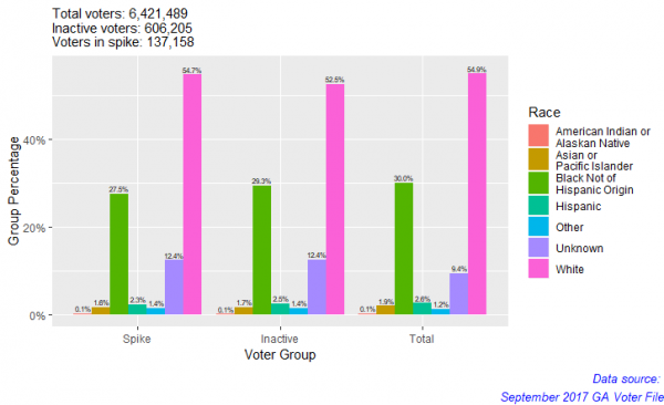
White people are the majority in each group (54.7% of spike; 52.5% of total inactive voters; 54.9% of total voters). Because white people make up the majority in the total voter file, their representation in the spike and total inactive voters is not concerning. For all groups, these percentages suggest that representation within the spike and within total inactive voters proportionate. To extend this project, we could possibly use some type of distribution test to compare the proportions statistically.
Now that we have had an over all look of the voter file, I decided to look at activity in the spike. For this part of the analysis, I decided to repeat the analysis above on three different groups:
- People who voted in the 2016 General Election
- People purged between the spike and November 2017
- People who voted in 2016 General Election and were removed between the spike and November 2017
For each group (and as above) I examined each of the three subgroups I created earlier — (1) voters in the spike, (2) voters who are inactive, and (3) total voters in the entire September 2017 voter file.
Group 1: People who voted in the 2016 General Election
To look at everyone in the spike who voted, I took my original subset of inactive voters and filtered it by the spike date for their date changed and by election day 2016 for their date last voted. I chose election day only and did not include early voters because I could not find anyone in the spike who had voted early.
# Spike voted
spike.voted <- inactive.sept17 %>%
filter(DATE_CHANGED == "2017-08-09" & DATE_LAST_VOTED == "2016-11-08")
voted_by_spike <- nrow(spike.voted) / nrow(inactive.spike) * 100
voted_by_inactive <- nrow(spike.voted) / nrow(inactive.sept17) * 100
voted_by_total <- nrow(spike.voted) / nrow(ga_voter.sept17) * 100
voted <- tibble(Voted = c('Total', 'Inactive', 'In Spike'),
Percent = c(voted_by_total, voted_by_inactive, voted_by_spike))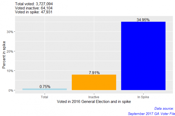
I was surprised (and somewhat suspicious) that ~35% of the spike had voted on election day in 2016. A question worth asking is why 47,931 election day voters became inactive less than a year later? We should also remember that the spike does account for 22.6% of all the inactive voters in the September 2017 voter file which is a year after the presidential election.
Looking at the racial breakdown of each population, I repeated the process of grouping by race, creating tables of the percentages of each race by their respected population, and combined the results.
# Voted by race / all voted
voted_overall.race <- all.voted %>%
group_by(RACE) %>%
summarise(Total = n()/nrow(all.voted) * 100) %>%
arrange(desc(Total))
voted_overall.race
# Voted in spike by race / all voted in spike
voted_in_spike.race <- spike.voted %>%
group_by(RACE) %>%
summarise(Spike = n() / nrow(spike.voted) * 100) %>%
arrange(desc(Spike))
voted_in_spike.race
# Voted inactive by race / all voted inactive
voted_by_inactive.race <- inactive.voted %>%
group_by(RACE) %>%
summarise(Inactive = n() / nrow(inactive.voted) * 100) %>%
arrange(desc(Inactive))
voted_by_inactive.race
# Make a table for all results to compare proportions
overall_inactive <- merge(x = voted_overall.race, y = voted_by_inactive.race, by = "RACE")
overall_inactive_spike.1 <- merge(x = overall_inactive, y = voted_in_spike.race, by = "RACE") %>%
arrange(desc(Total))
format(overall_inactive_spike.1, digits=1, nsmall=2)
# Using gather, we can make the data more friendlier to work with in a graph
overall_inactive_spike.2 <- overall_inactive_spike.1 %>%
gather(Total, Inactive, Spike, key="Voters", value="Percent") %>%
arrange(RACE)
format(overall_inactive_spike.2, digits=1, nsmall=2)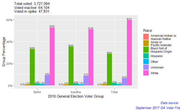
It seems that there is a noticeable disproportion in spike and inactive voters from total voters. We can see this because while the percent of white people drops from total to inactive and/or spike voters, the percent of black people goes up. This result indicates that white people’s representation in the spike and inactive voter groups is smaller than their overall representation and the opposite is true for black people — their representation appears disproportionate.
Group 2: People purged between spike and November 2017
After looking at people in the spike who voted, the next question I had was how recently are people removed once they become inactive?
I used the November 2017 Georgia voter file and to look for people in the spike who were in the spike but not in the November 2017 voter file. This would mean that sometime between them becoming inactive and the release of the November 2017 voter file that the voter had been purged.
# How many were purged from the entire voter file?
purged.all <- ga_voter.sept17 %>% filter(!(ga_voter.sept17$REGISTRATION_NUMBER %in% ga_voter.nov17$REGISTRATION_NUMBER))
# How many were purged from the spike?
purged.spike <- inactive.spike %>% filter(!(inactive.spike$REGISTRATION_NUMBER %in% ga_voter.nov17$REGISTRATION_NUMBER))
# How many were purged that were inactive?
purged.inactive <- inactive.sept17 %>% filter(!(inactive.sept17$REGISTRATION_NUMBER %in% ga_voter.nov17$REGISTRATION_NUMBER))
purged_by_spike <- nrow(purged.spike) / nrow(inactive.spike) * 100
purged_by_inactive <- nrow(purged.spike) / nrow(inactive.sept17) * 100
purged_by_total <- nrow(purged.spike) / nrow(ga_voter.sept17) * 100
purged <- tibble(Voters = c('Total', 'Inactive', 'In Spike'),
Percent = c(purged_by_total, purged_by_inactive, purged_by_spike))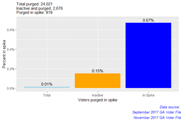
Less than 1% of the spike was purged from the voter file. Although that is a small percent, it is still over 900 people.
Next, I looked at the racial breakdown of this group — purged voters from the spike.
# Purged by race / all purged
purged_total.race <- purged.all %>%
group_by(RACE) %>%
summarise(Total = n() / nrow(purged.all) * 100) %>%
arrange(desc(Total))
purged_total.race
# Purged by race in spike / purged in spike
purged_by_spike.race <- purged.spike %>%
group_by(RACE) %>%
summarise(Spike = n() / nrow(purged.spike) * 100) %>%
arrange(desc(Spike))
purged_by_spike.race
# Purged by race inactive / all inactive
purged_by_inactive.race <- purged.inactive %>%
group_by(RACE) %>%
summarise(Inactive = n() / nrow(purged.inactive) * 100) %>%
arrange(desc(Inactive))
purged_by_inactive.race
# Make a table for all results to compare proportions
purged_inactive <- merge(x = purged_total.race, y = purged_by_inactive.race, by = "RACE")
purged_inactive_spike.1 <- merge(x = purged_inactive, y = purged_by_spike.race, by = "RACE") %>%
arrange(desc(Total))
format(purged_inactive_spike.1, digits=1, nsmall=2)
# Using gather, we can make the data more friendlier to work with in a graph
purged_inactive_spike.2 <- purged_inactive_spike.1 %>%
gather(Total, Inactive, Spike, key="Voters", value="Percent") %>%
arrange(RACE)
format(purged_inactive_spike.2, digits=1, nsmall=2)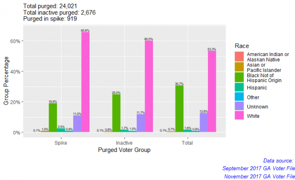
It seems that among the spike, white people are most disproportionate. Hispanic people are slightly disproportionate. This seems to contradict most findings that say people of color are more disproportionate than whites when it comes to voter purges in Georgia. Why am I not finding this here? I will discuss this after our next analysis.
Group 3: People who voted in 2016 General Election and were removed between the spike and November 2017
To tie everything together, my final question was how many purged voters from the spike voted on election day in 2016? I used my previous subset of purged voters and filtered it for dates last voted equal to November 8th, 2016.
purged_all.voted <- purged.all %>%
filter(DATE_LAST_VOTED == "2016-11-08")
purged_inactive.voted <- purged.inactive %>%
filter(DATE_LAST_VOTED == "2016-11-08")
purged_spike.voted <- purged.spike %>%
filter(DATE_LAST_VOTED == "2016-11-08")
voted_purged_by_spike <- nrow(purged_spike.voted) / nrow(inactive.spike) * 100
voted_purged_by_inactive <- nrow(purged_spike.voted) / nrow(inactive.sept17) * 100
voted_purged_by_total <- nrow(purged_spike.voted) / nrow(ga_voter.sept17) * 100
voted_and_purged <- tibble(Voters = c('Total', 'Inactive', 'In Spike'), Percent = c(voted_purged_by_total, voted_purged_by_inactive, voted_purged_by_spike))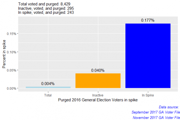
We’ve reduced the data quite a bit. If 295 election day voters were inactive (this includes the 243 election day voters in the spike), then who are the remaining 8,134 voters that voted in the election and were removed? These are voters whose statuses are active. Did 8,134 voters move, die, or a combination of both? Looking at the 8,134 purged 2016 election voters would be something interesting to take away from the project and do further analysis on. For now, let’s check out the racial breakdown.
voted_purged_all.race <- purged_all.voted %>%
group_by(RACE) %>%
summarise(Total = n() / nrow(purged_all.voted) * 100) %>%
arrange(desc(Total))
voted_purged_all.race
voted_purged_inactive.race <- purged_inactive.voted %>%
group_by(RACE) %>%
summarise(Inactive = n() / nrow(purged_inactive.voted) * 100) %>%
arrange(desc(Inactive))
voted_purged_inactive.race
voted_purged_spike.race <- purged_spike.voted %>%
group_by(RACE) %>%
summarise(Spike = n() / nrow(purged_spike.voted) * 100) %>%
arrange(desc(Spike))
voted_purged_spike.race
# Make a table for all results to compare proportions
voted_purged_inactive <- merge(x = voted_purged_all.race, y = voted_purged_inactive.race, by = "RACE")
voted_purged_inactive.1 <- merge(x = voted_purged_inactive, y = voted_purged_spike.race, by = "RACE") %>%
arrange(desc(Total))
format(voted_purged_inactive.1, digits=2, nsmall=2)
# Using gather, we can make the data more friendlier to work with in a graph
voted_purged_inactive.2 <- voted_purged_inactive.1 %>%
gather(Total, Inactive, Spike, key="Voters", value="Percent") %>%
arrange(RACE)
format(voted_purged_inactive.2, digits=2, nsmall=2)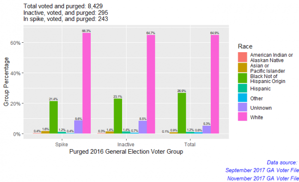
The disproportion still seems to effect white people the most. It also effects people of unknown race and seems to slightly effect Asian or Pacific islanders as well.
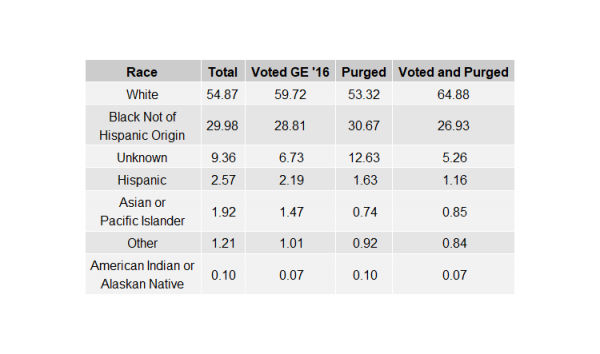
The question that still sticks out is why are white people disproportionately represented in purged and recently voted purged voters and not of people of color like so many other analyses have shown? My first assumption is that I simply do not have enough data. I should look across more than just two different voter files. Another factor maybe how I am examining the data. I am focused on a subsets between two voter files and not across the entire year or multiple months and voter files. Maybe if I only looked at purged voters across multiple months and voter files, I might find disproportions.
To wrap things up, I decided to create a horizontal bar graph displaying all total populations among the groups we have observed — (1) Everyone in the voter file, (2) People who voted in the 2016 General Election, (3) People purged between the spike and November 2017, and (4) People who voted in 2016 General Election and were removed between the spike and November 2017.
# Compare total populations of each group and overall
total_populations.1 <- tibble(Race = c("WH", "U", "OT", "HP", "BH", "AP", "AI"), Overall = total_inactive_spike.1$Total, Voted = total_inactive_spike.voted.1$Total, Purged = purged_inactive_spike.1$Total, Voted_And_Purged = voted_purged_inactive.1$Total)
total_populations.1
total_populations.2 <- total_populations.1 %>%
gather(Overall, Voted, Purged, Voted_And_Purged, key = "Total_Type", value = "Percent")
total_populations.2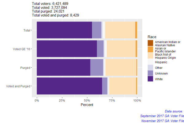
Challenges
My greatest over all challenge in this project was trying not to get lost in the data. I believe I greatly underestimated how easily it is to “go down the rabbit hole” when analyzing data. At almost every turn, it seemed as if there was a new question to be asked. I had to learn how to organize my thoughts and make a game plan before diving into the data. So in short, I spent many hours coding things that did not end up in the final project.
Another challenge was trying to figure out how I wanted to ask my questions. Because I did a lot of subsets of subsets of subsets, it got overwhelming at times to calculate what exactly I wanted to see, what I needed to do to see it, and how to visualize it. This was also a crucial step before diving too far into the data and beginning to code. I ended up creating a detailed outline on Word breaking my project into sections and what I needed to calculate. Luckily, the analysis is repetitive, so once I had some initial calculations, I just needed to create my subsets properly and apply the calculations with respect to the subsets.
Conclusion
For the most part, I don’t think there was anything outstanding or damning to be found, but I do believe this set the course towards a closer look into voter purges and how they operate in the state of Georgia. A next step in this project would be to use more data and look for the overall purges over the course of a year. I believe doing that would most likely lead us to the effect that others had found regarding disproportions. Another step I would like to take is doing statistical analysis on this project. I need to do some more research on what tests need to be used and how to properly visualize the results. All in all, this was a great learning experience for me personally and learning R and all of it’s bells and whistles was very exciting. I plan to continue doing further analysis on this and other related projects to help contribute to fighting for a fair democracy.





Connect with us